Trip Manager
Redesigning a 20-year-old freight tracking platform for 4,000+ tractors.
ClientC.R. England
RoleLead Product Designer
Duration1–2 year engagement
Year2024
Redesigning a 20-year-old freight tracking platform for 4,000+ tractors.
Trip Manager is a multi-role operations platform spanning dispatchers, drivers, and operations managers across 4,000+ trucks and 50,000 daily delivery stops. The system surfaces real-time load data across three surfaces: a web dashboard, a mobile cab display, and internal ops tools. Each one serves users with completely different needs, constraints, and levels of technical comfort. Dispatchers need full data density and fast action. Drivers need glance-readable clarity in a moving vehicle. Ops managers just need status at a glance, no noise.
The legacy Trip Manager application was over 20 years old. Outdated, cluttered with non-functional features, difficult to maintain. Following a 2021 data breach, modernization became critical, despite plenty of skepticism about moving off a system people had used for two decades. Primary users (20+ operations managers) dealt with excessive horizontal scrolling, dropdown menus with unclear parameters, non-accessible fonts, no real-time tractor location access, and no integrated driver communications. Over half of the current view went unused, yet operations teams still managed 4,000+ tractors and 50,000 daily delivery stops through this fragmented interface.
The real issue wasn't the interface itself. It was a system built as if dispatchers, drivers, and ops managers all needed the same thing. They didn't, and the interface failed all three groups roughly equally.
We chose progressive disclosure over a flat data table because operations staff managing dozens of active trips cannot parse 12 fields simultaneously. The most critical action needed to be one click, not three screens deep.
We designed role-specific views rather than a single universal interface. Dispatcher, driver, and ops manager needs were divergent enough that one layout couldn't serve all three without forcing compromises that hurt the highest-stakes users.
We prioritized the dispatch view in v1 over the driver view, because dispatcher errors were creating downstream problems at 10x the rate of driver friction. We validated this with ops leads before committing.
We kept the legacy system running in parallel during rollout instead of a hard cutover. Less risk for a team managing live freight that genuinely couldn't afford downtime.
When I proposed role-specific views for dispatchers, drivers, and ops managers, the product director and development team pushed back immediately. Their concern had nothing to do with user experience. It was maintenance: three distinct views meant three surfaces to build, test, and sustain. Rather than argue the case in the abstract, I proposed a manual workaround: users could hide irrelevant tabs themselves through a dropdown menu. No engineering lift. No commitment. Just enough to let each role experience a cleaner, more relevant interface in real working conditions. It didn't persist between sessions at first. That was acceptable. The goal wasn't a polished solution — it was to make the value tangible before asking anyone to build anything. Over time the benefit became undeniable. The development team, who had raised the original objection, pushed for the persistent version themselves. The BA and product director followed. The feature was subsequently scoped and is either in production or on the roadmap. The people who pushed back became the people who advocated for it.
I knew a separate fleet-switching app existed alongside Trip Manager — it allows users to temporarily change their fleet assignments when covering for others. A junior account manager who normally sees fleets A, B, and C might need access to all fleets A through Z for a weekend shift. I scoped it out. Trip Manager is order-based, not fleet-based, and the two systems felt like separate domains. In retrospect, I would have mapped how temporary role escalations like that interact with role-specific views before finalizing the information architecture. That edge case likely contributed to the early resistance to role separation. Understanding it sooner would have helped me design a more defensible solution — or make the case for solving the permissions problem upstream before the UI work began. The lesson wasn't that I needed to understand development better. It was that I needed to ask better questions about how people actually move through the organization before designing for how they're supposed to.
Delivered a unified, stakeholder-approved design that replaced the fragmented legacy system. The process built stronger cross-department collaboration among teams that rarely interacted before, and created a scalable framework for the remaining use cases. Stakeholder buy-in went up too, but that was really a byproduct of getting them involved early. Teams used the system very differently than I'd expected going in, and every time I assumed I knew the answer, staying flexible turned out to matter more.
These screens represent a selection from a 1–2 year engagement redesigning a 20-year-old freight tracking system used by 20+ operations managers to manage 4,000+ tractors and 50,000 daily delivery stops. The full system spans additional views, states, role-based layouts, and edge case handling not shown here.
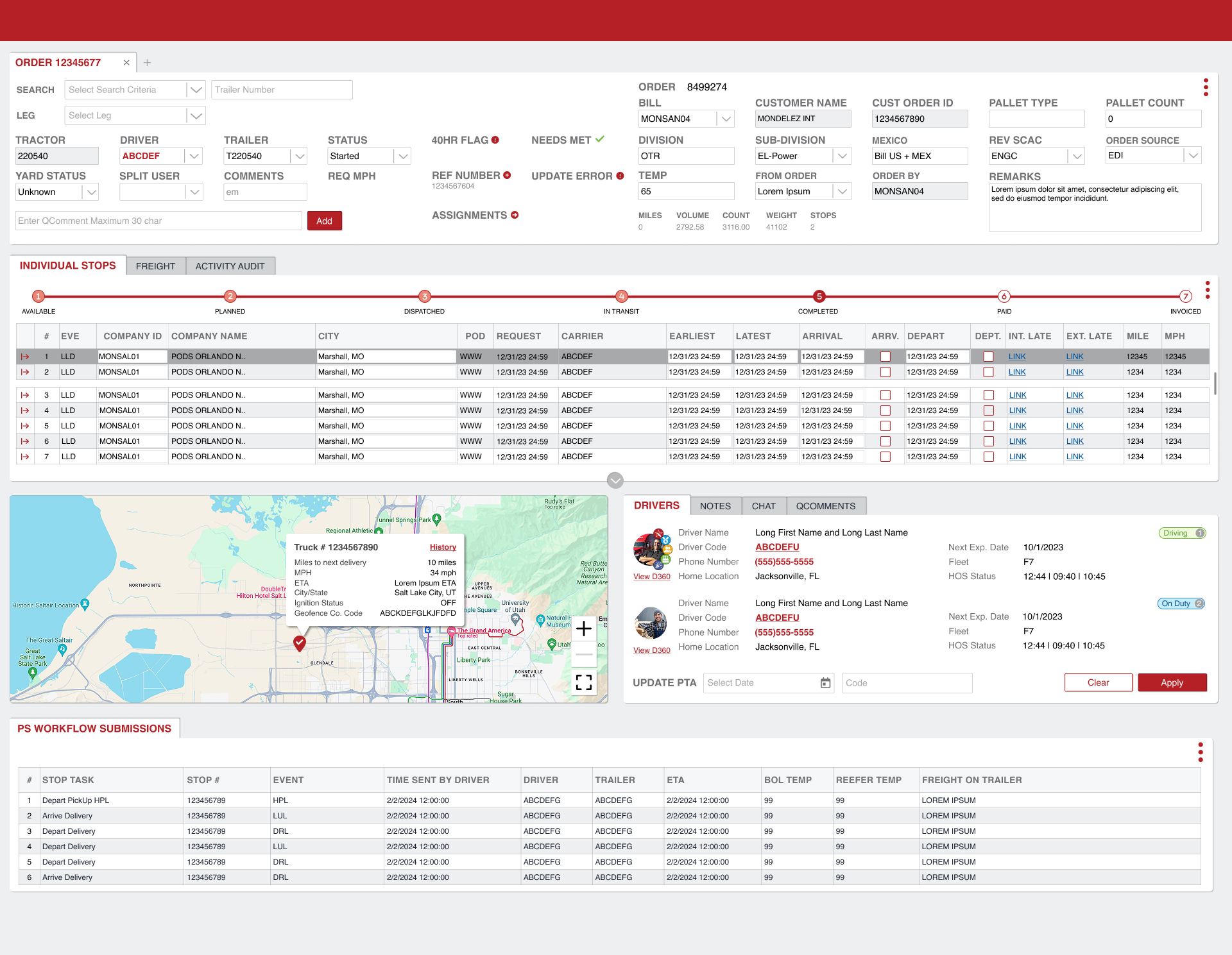
Main dashboard — fleet overview. The primary operations surface. Designed to surface real-time trip status, driver assignments, stops, and alerts across the entire fleet without requiring users to open individual records. Information density was intentional — ops managers need every data point visible at once. The goal was making density navigable, not reducing it.
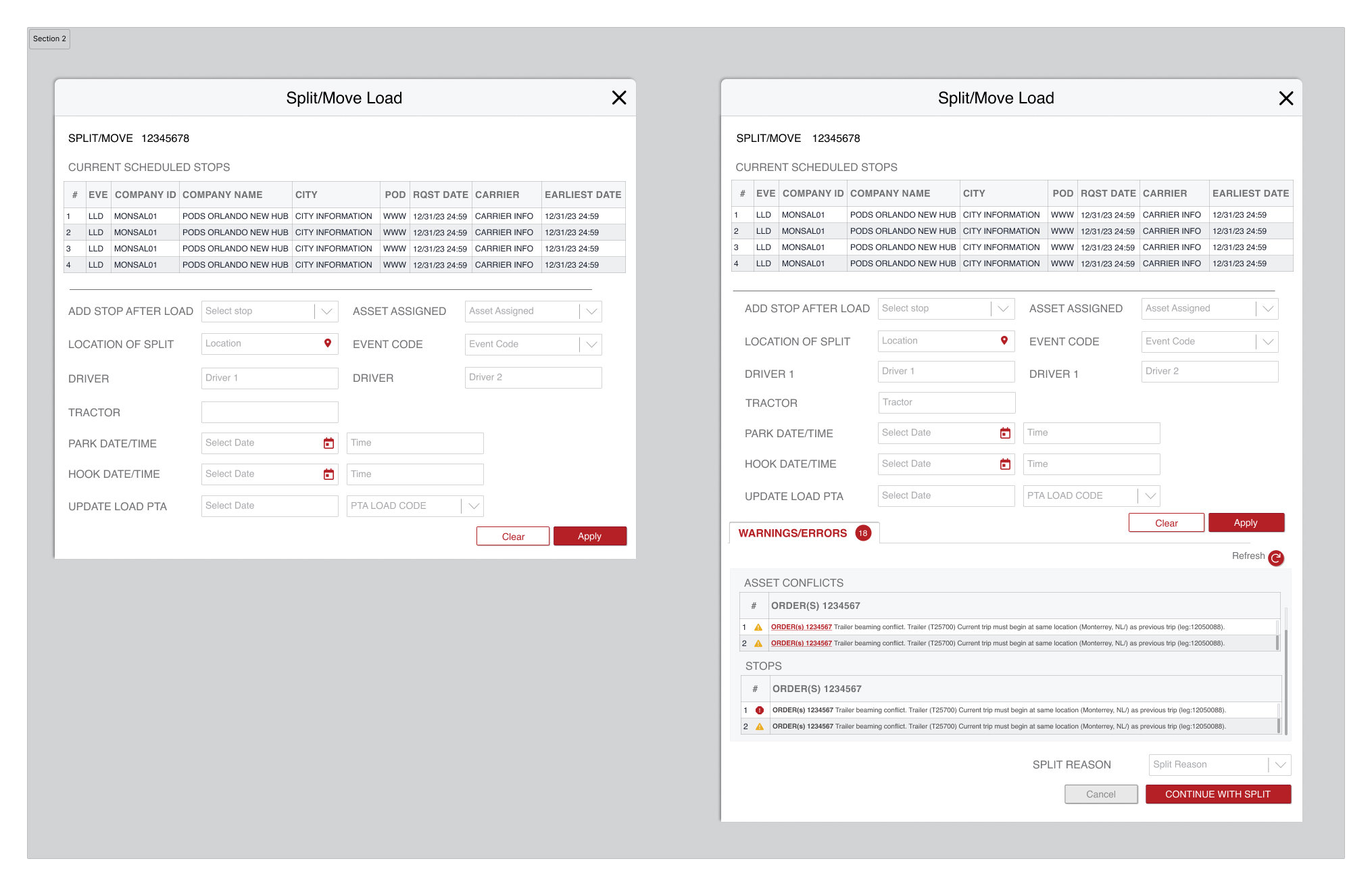
Split/Move Load — standard. A modal workflow for splitting or reassigning loads between drivers and tractors. Designed to capture stop sequences, asset assignments, event codes, and driver details in a single flow — reducing the multi-tool process it replaced.
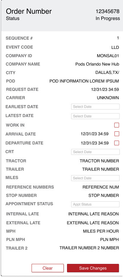
Order detail panel. Full order record including stop sequence, carrier assignment, contact info, schedule times, and appointment status. Designed to give ops managers a complete picture of a single order without navigating away from the main view.
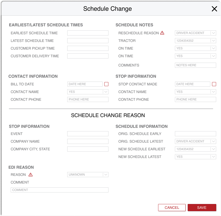
Schedule change form. A structured form for documenting schedule changes — capturing earliest/latest times, reschedule reasons, EDI reason codes, and stop contact details. Designed to create a complete audit record for every schedule modification, not just the outcome.
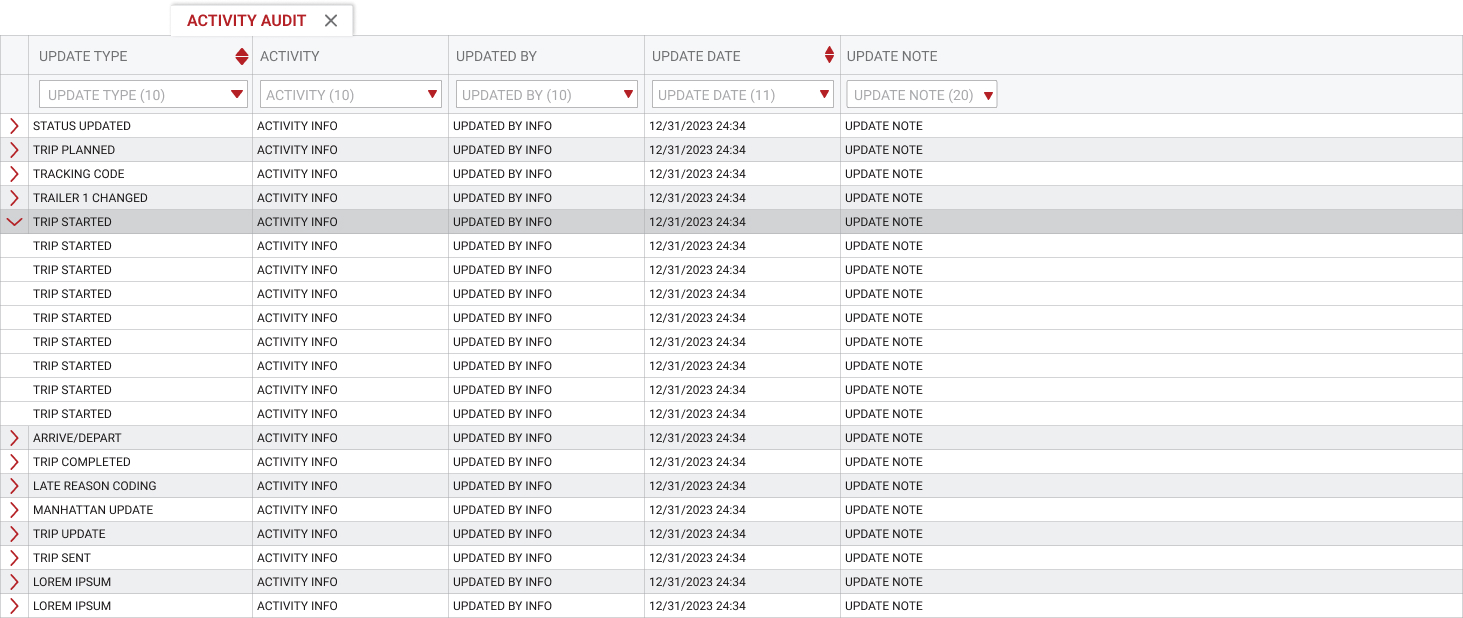
Activity Audit. A filterable audit trail of every change made to a trip — who, what, and when. Expandable row groupings let ops managers scan the high-level story first and drill into specifics only when needed. The accountability layer that makes the entire Trip Manager system auditable.
Trip Manager's primary audience is operations managers handling 4,000+ tractors and 50,000 daily stops. These are not casual users — they are power users who need every piece of information visible and actionable at once. The design philosophy was not to simplify by removing information, but to make complexity navigable through clear hierarchy, consistent status indicators, and role-specific views that surfaced only what each role needed to act on.