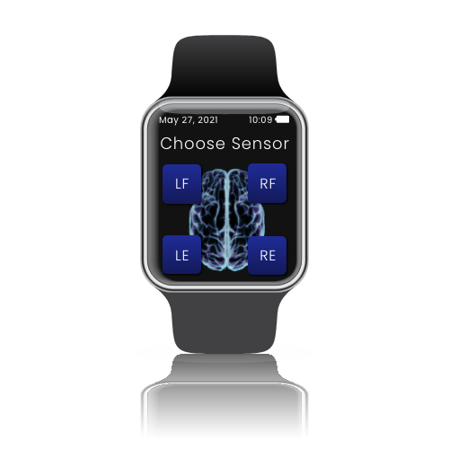
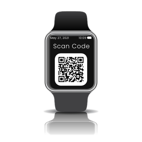
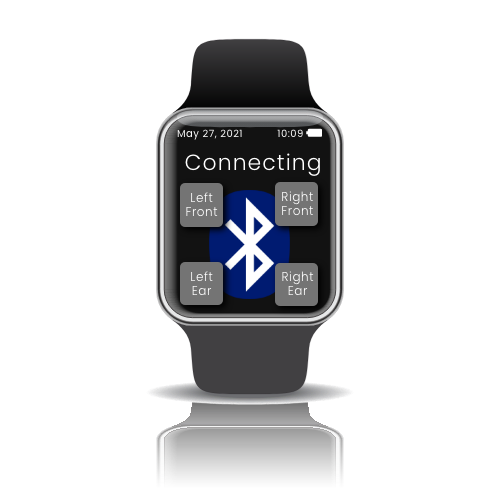
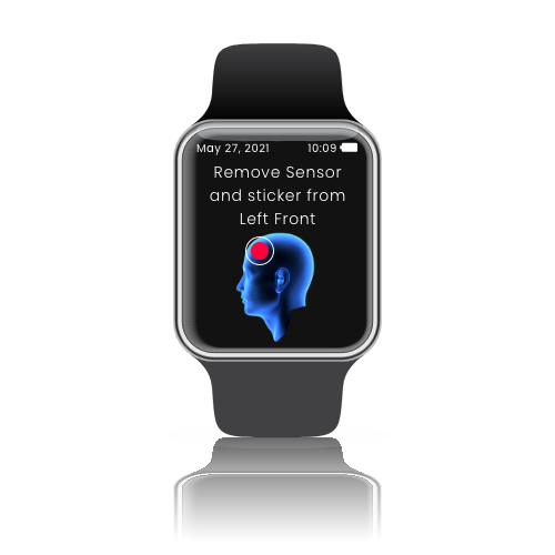
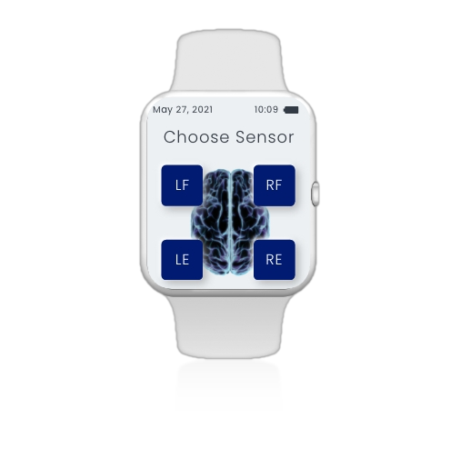
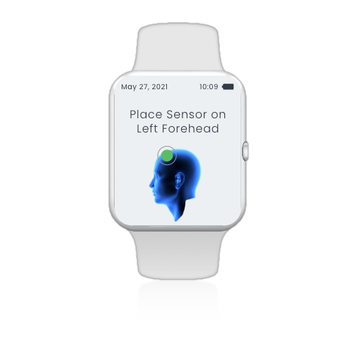
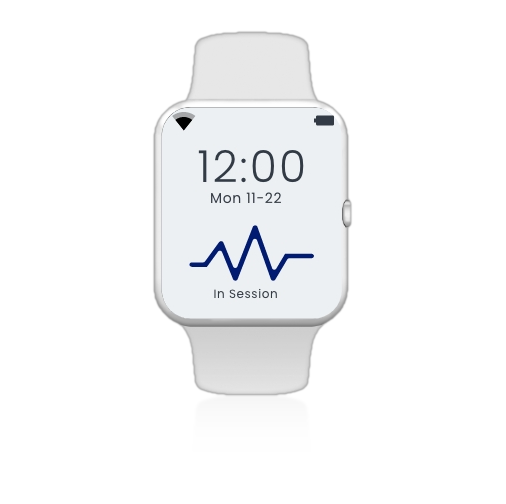
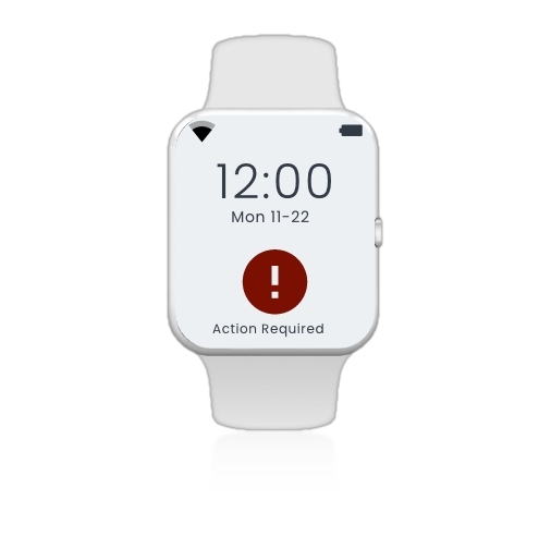
A greenfield UX challenge: build an accessible seizure-monitoring experience for patients of all ages and abilities — with no existing design to start from.

The REMI is a wearable EEG smartwatch that lets patients monitor seizure activity from home. When I joined Epitel, there was no app, no design system, no established UX process. I designed the entire patient-facing experience from scratch: watch UI, companion app, and clinician dashboard, all at once, all needing to be accessible, all under FDA scrutiny.
There was no existing pattern to lean on, and no room for trial and error — every screen had to hold up against FDA compliance requirements before it could ship. The hardest part wasn't the complexity of the system. It was the audience.
Patients and clinicians ranged from neurologists reviewing clinical data to elderly patients and children who'd never used a medical device, let alone one tracking something as serious as seizure activity. The design had to work for all of them, on a screen the size of a watch face.
I was the sole UX designer and front-end developer on the project. I owned the end-to-end design process, starting with story mapping sessions with the product team and carrying through to building the UI screens in React myself. I worked directly with the Senior Software Architect to check design decisions against both technical constraints and FDA compliance requirements.
I invested in story mapping before any wireframes, even though it slowed down early output. Mapping every edge case and failure state upfront meant far fewer expensive reworks once development started — a trade I'd make again on any regulated product.
I treated accessibility as a starting constraint, not a checklist to run through at the end. That meant every interaction had to work without fine motor precision and every piece of clinical data had to read clearly to someone with zero medical background, shaping layouts and language from the first sketch.
I pushed to validate high-fidelity prototypes with real usability testing before a single line of production code existed. On a project with no budget for expensive rebuilds, catching confusion in a prototype was far cheaper than catching it in a shipped device.
I worked directly with the Senior Software Architect on every major decision, checking it against both technical feasibility and FDA compliance before it moved forward.
With more time, I would have pushed for earlier and more frequent usability testing with actual patients, not just prototypes reviewed internally. Medical device UX benefits enormously from real-world observation. I think we would have surfaced some friction points sooner if we'd gotten out of the building more. It's something I've carried into every project since.
Early dark-theme exploration alongside the final light-theme direction — shown together to reflect how the design evolved.