Design System Documentation
AI-augmented documentation for a 23-component React library.
ClientC.R. England
RoleLead Product Designer
DurationMarch – April 2026
Year2026
AI-augmented documentation for a 23-component React library.
C.R. England's engineering team had a mature 23-component React library powering all their enterprise products, but designers and BAs had no real way to access it. I built the documentation layer that made the system visible, usable, and maintainable across the organization.
C.R. England's engineering team had built a mature React component library, cre_react_lib, containing 23 shared UI components used across multiple internal applications. It had a working Storybook instance and a real codebase behind it, but almost nothing accessible to designers or business analysts. There was no Figma design system, no documentation, no single source of truth outside the code itself. That created a slow, fragile handoff process: designers requested specs verbally from engineers, BAs didn't know what components existed, and new features risked visual inconsistencies nobody caught until later. Rebuilding all 23 components in Figma by hand would have taken weeks with no guarantee of accuracy.
I extracted specs directly from source files instead of screenshotting Storybook. That's what stops the design-to-dev drift that builds up whenever documentation gets recreated by hand.
I used Claude AI for extraction and formatting, but every judgment call was mine: flagging inconsistencies, identifying gaps, deciding what to do with the edge cases.
I built every component page to the same template, so the documentation reads well for BAs and still parses cleanly for a future Figma plugin.
I documented edge cases on their own terms instead of forcing every component into the same box — FileUpload had no CSS file at all, Select was styled inline through react-select's config, RadialProgress needed CSS custom properties instead of fixed values. Each one got handled the way its actual implementation demanded.
Delivered complete Confluence documentation for all 23 components: exact pixel specs, color token tables, typography specs, TypeScript prop interfaces, usage examples, and accessibility notes. The process surfaced real inconsistencies that had been hiding in the code, like danger variants using three different black tokens and success buttons using mismatched greens. The structured output is ready for a Figma plugin to consume and generate the component library from. If there's one thing this project confirmed, it's that AI collaboration at scale still runs on judgment. It handled extraction and formatting well, but every inconsistency, gap, and edge case still needed someone to actually decide something.
These artifacts represent a selection from an ongoing design system built for C.R. England — a shared component library spanning 23+ React components, documented in Storybook and Confluence, and used across all CRE enterprise products. Built in close collaboration with the Lead Software Engineer.
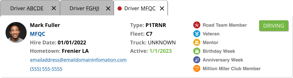
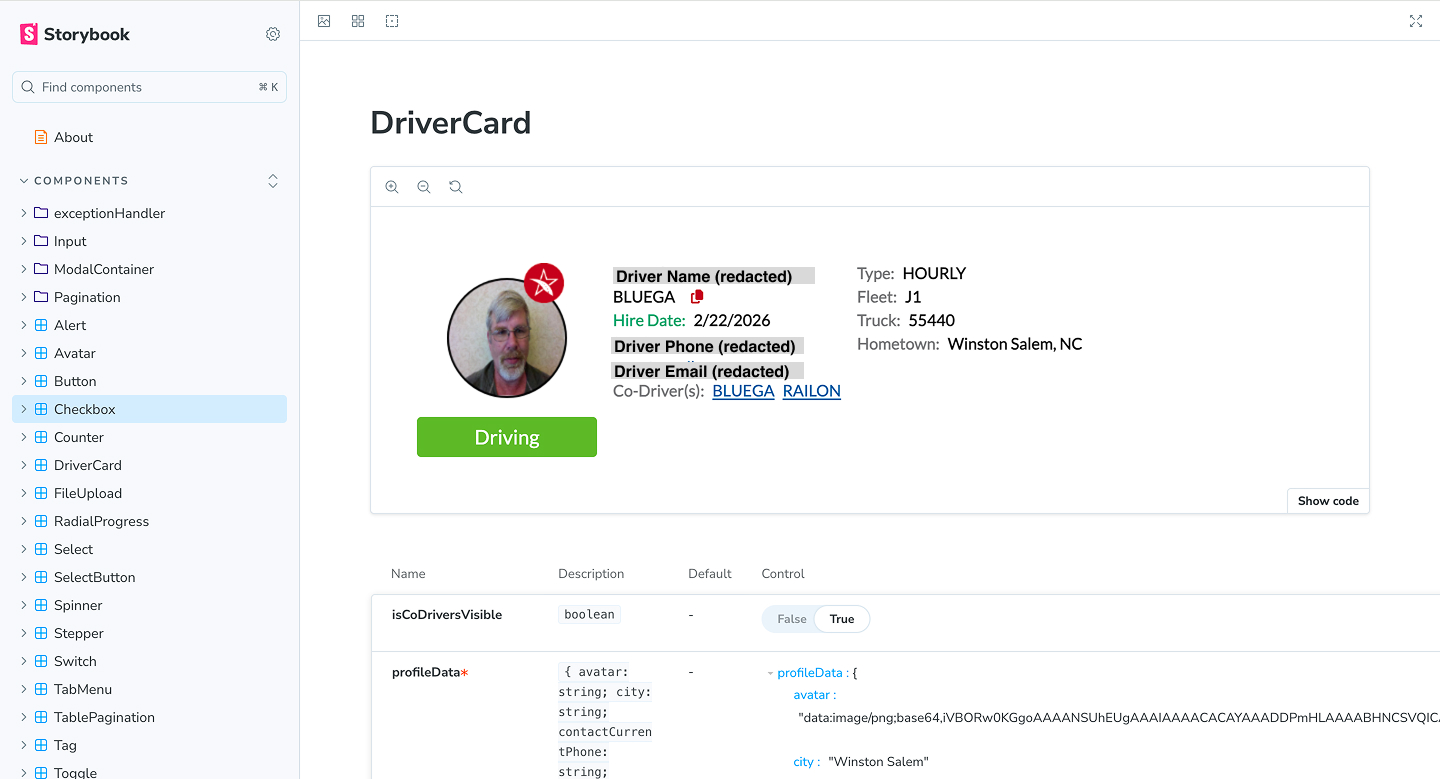
01 — Component in context — Driver Card. The Driver Card component as it appears across CRE products — showing the system working in production. A single component surfaces driver type, fleet, truck, hire date, location, contact details, and status badges from a shared, reusable source.
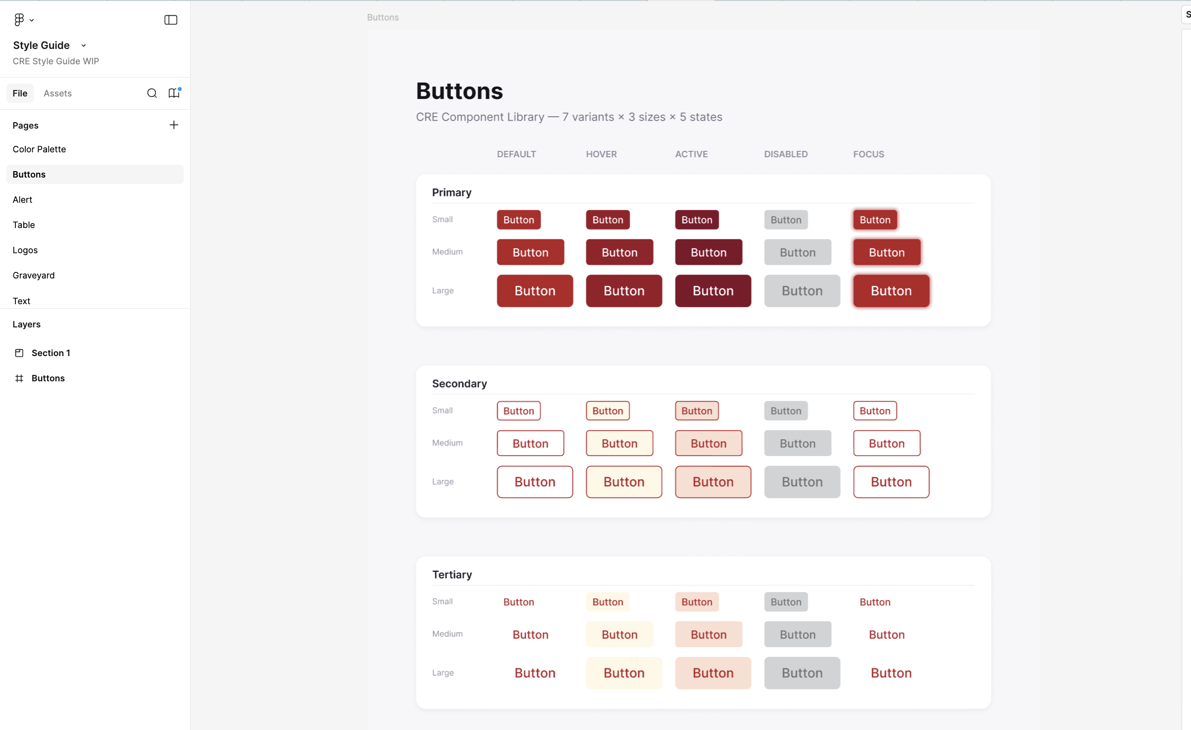
02 — Storybook — Button component. The Button component documented in Storybook — showing Primary, Secondary, and Tertiary variants across all states. Built to spec so developers pull directly from the library rather than recreating button styles per product.
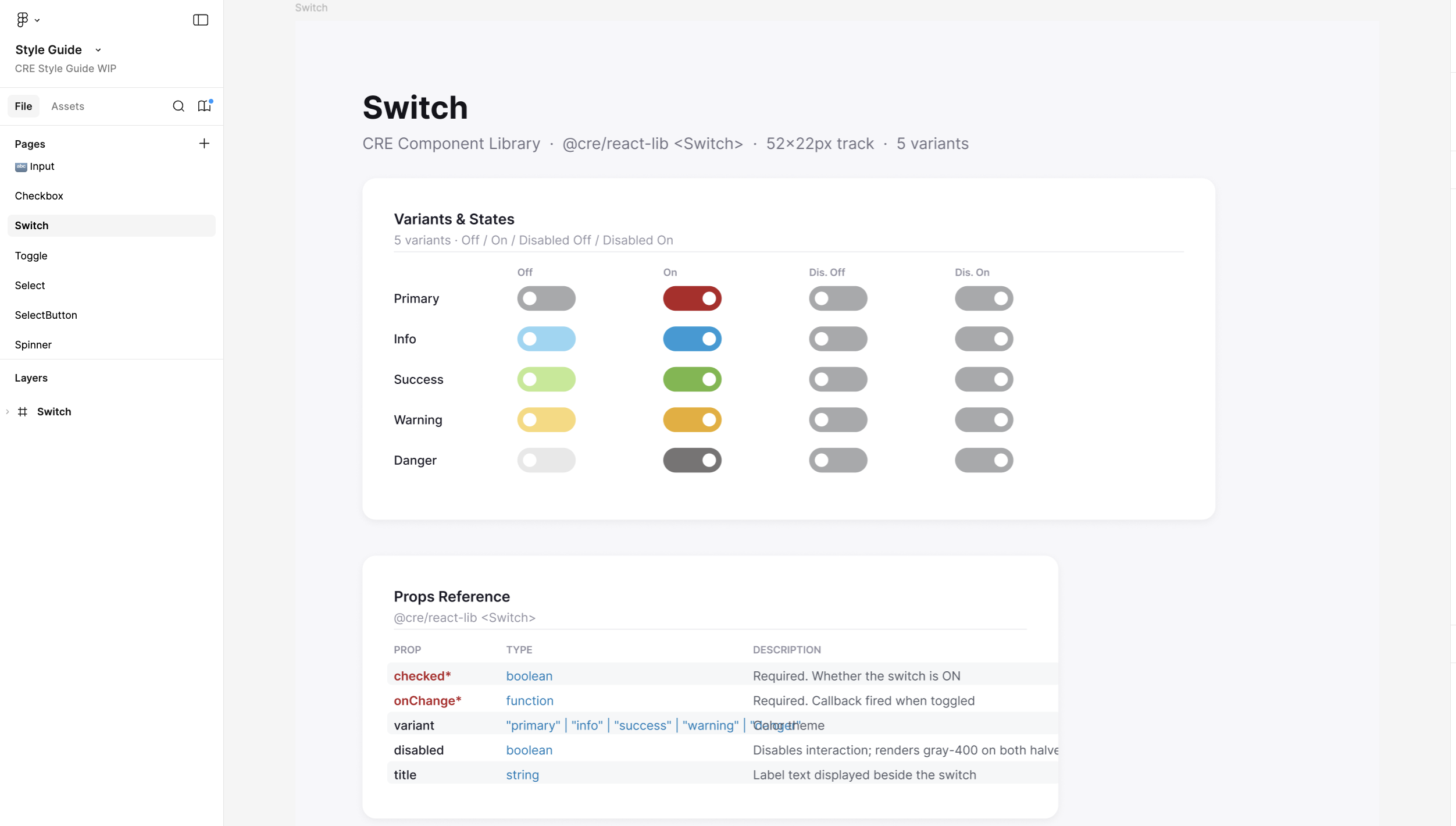
03 — Storybook — Switch component. The Switch component with all semantic variants — Primary, Info, Success, Warning, Danger — documented alongside prop references and interaction states.
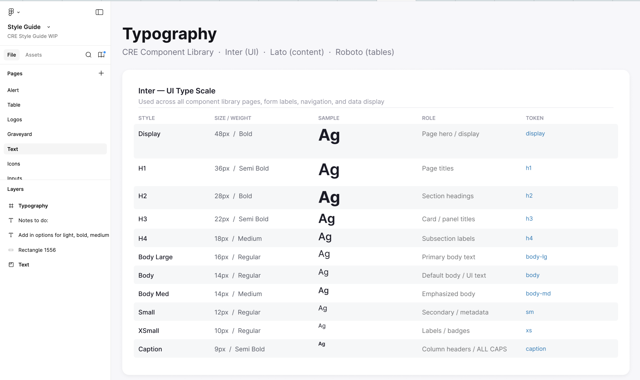
04 — Storybook — Typography scale. The full UI type scale — Display through Caption — with size, weight, usage context, and live examples.
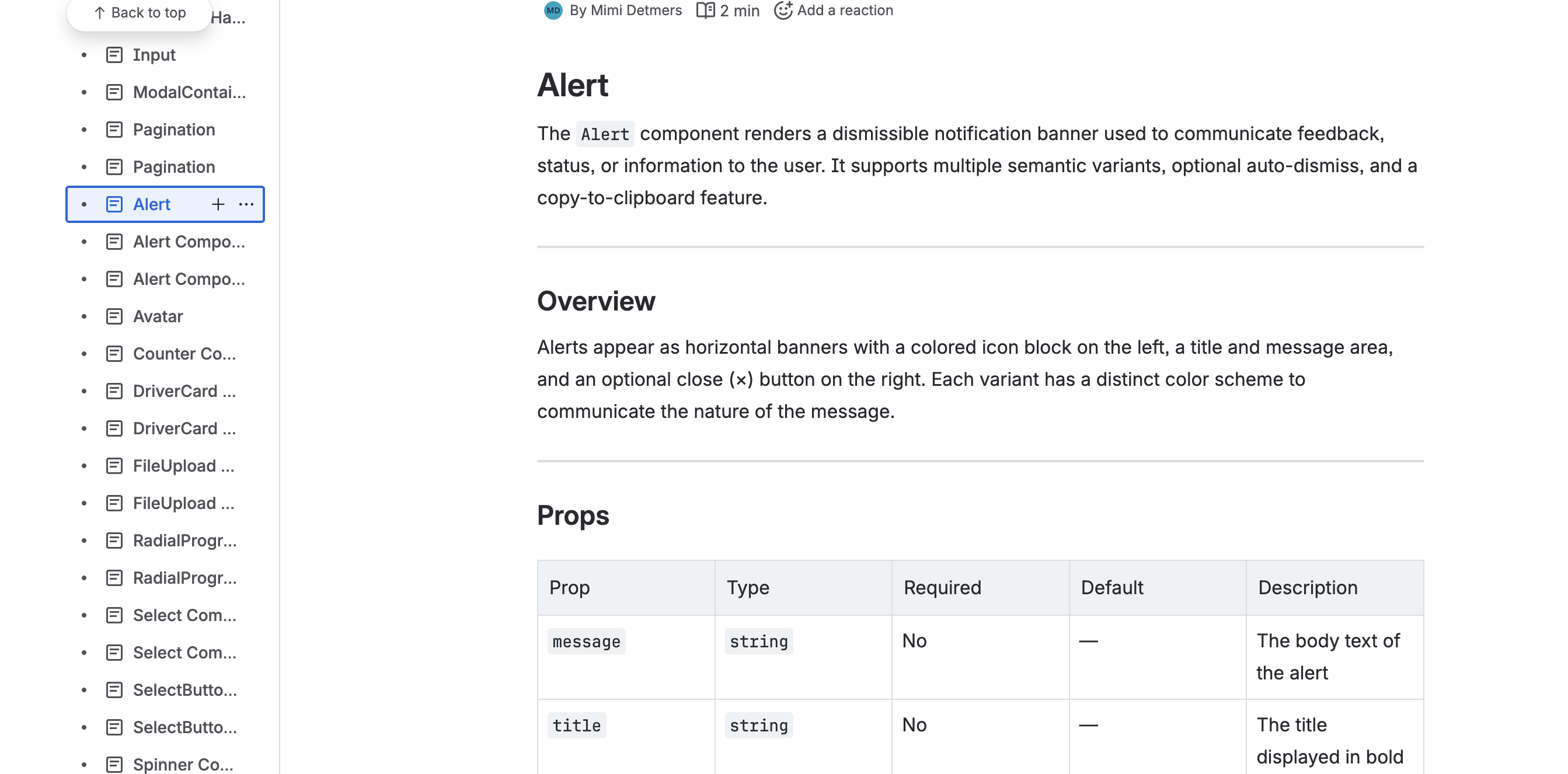
05 — Confluence — Alert component docs. Component documentation in Confluence — covering overview, props table, and usage guidance. Written to be human-readable and machine-parseable.
Every spec in this documentation was checked against the Lead Software Engineer's actual codebase, not against what a component was supposed to do on paper. That verification step is what makes documentation like this trustworthy enough for BAs and designers to actually build on, instead of treating it as a rough guide to double-check with engineering anyway.